Netflix Analytics Dashboard with Streamlit

For this project, Data Engineers and UX Designers worked on building a Netflix analytics dashboard using Streamlit. The goal was to turn raw ranking data into something structured, interactive, user-friendly, and useful for analysis. Also, just to have fun and have a feel of how to build dashboards in Streamlit.
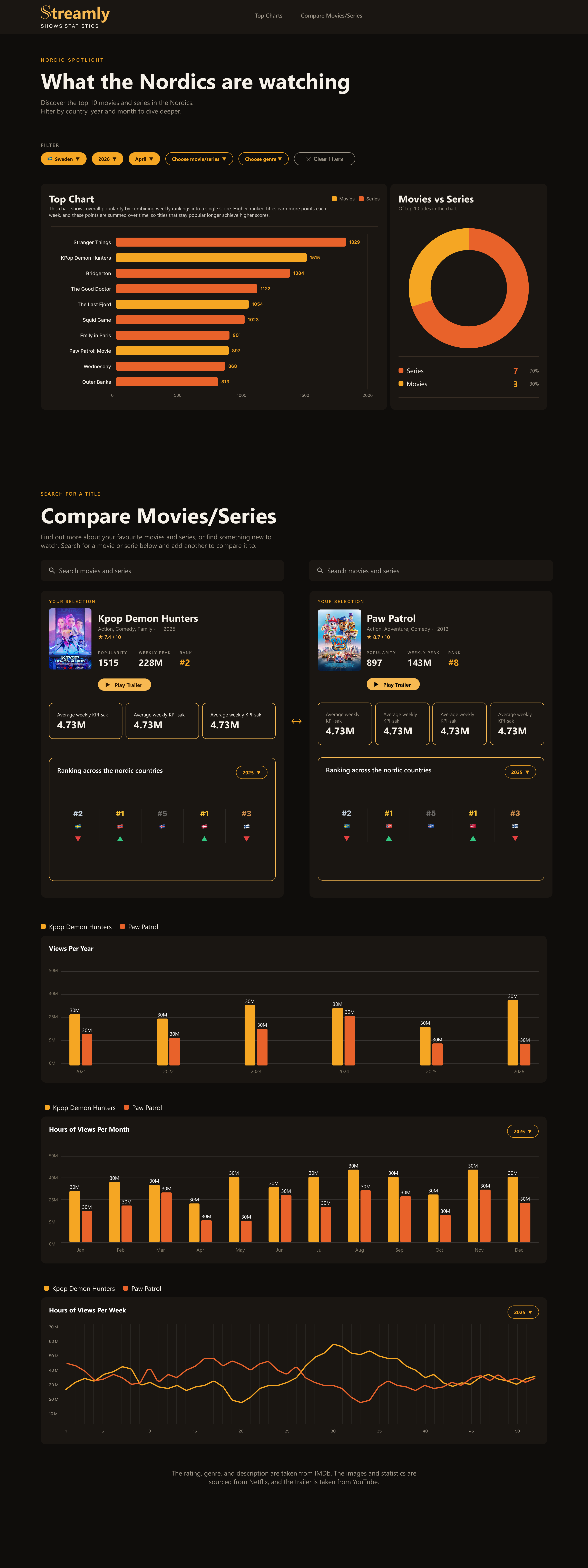
This project gave me a better understanding of how UX and Data Engineering work together. The UX team created the visual direction in Figma, and my task was to use that design into a working Streamlit application. That meant thinking about both technical logic and user experience: the dashboard had to be functional, but also clear, readable, and easy to navigate as a user.
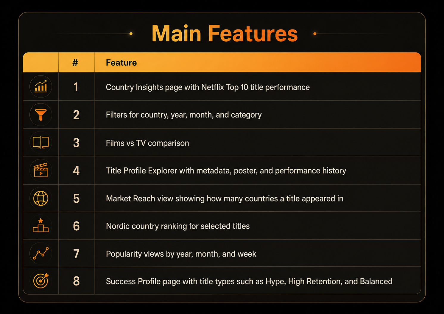
Overall, this project helped me see Streamlit as more than just a visualization tool. It became a way to build a small data product: starting from raw data, preparing it, applying business logic, and presenting insights through an interactive interface. The most valuable part for me was learning how much the quality of a dashboard depends on the data structure behind it.
- Our reference for creating the dashboard. Designed by UX Designers using Figma*
The Dataset
The dataset comes from Netflix Tudum and contains weekly Top 10 data from July 2021 to March 2026. Each row represents how a title performed in a specific country during a specific week. That means the data has a clear analytical grain: one title, one country, one week.
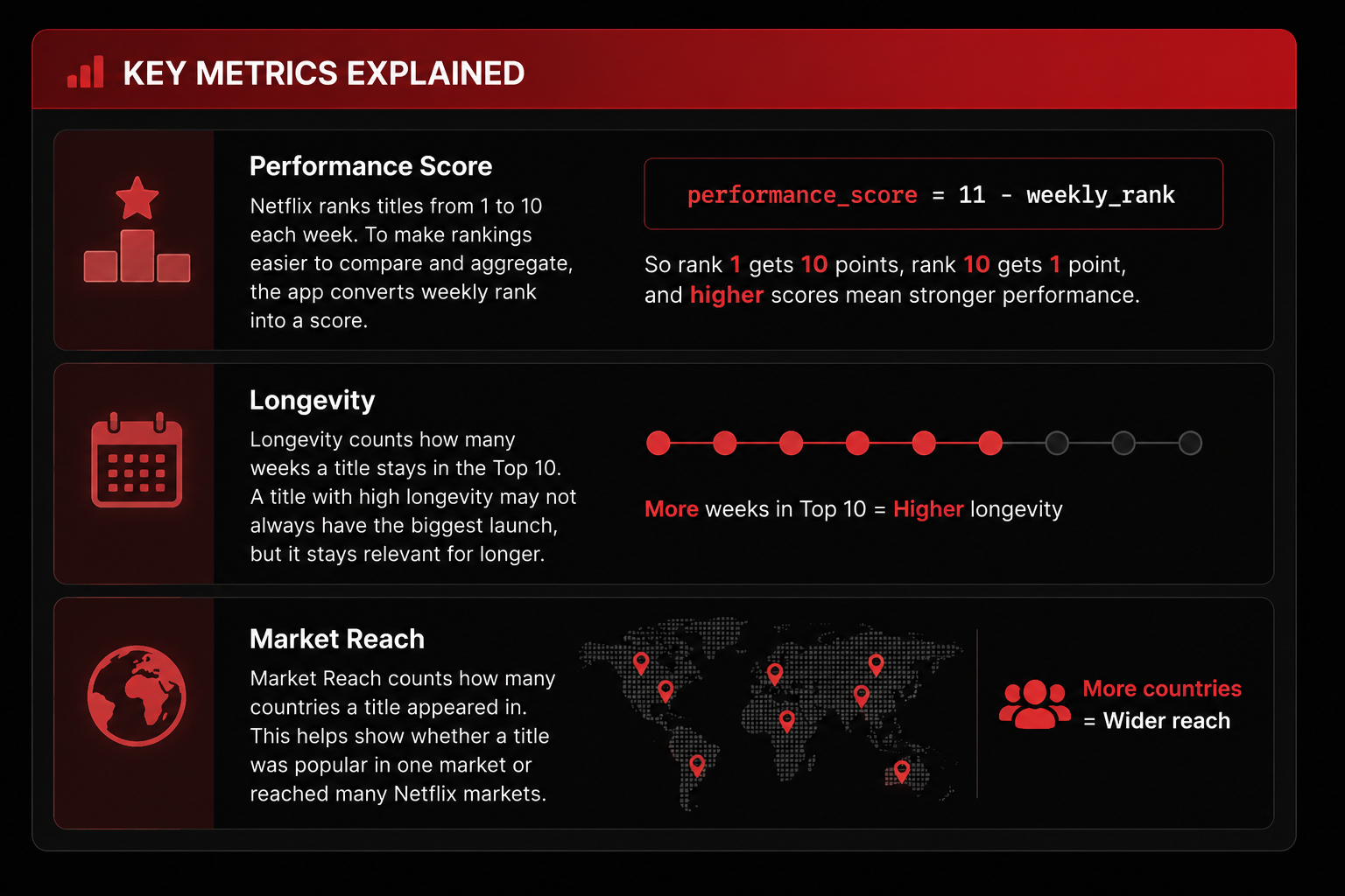
One of the biggest lessons in this project was that data visualization is not just about creating charts but also about making good decisions in the data transformation stage. For example, I had to decide when to filter the data, when to aggregate it, the measurements and what level of detail the chart should represent. If the aggregation is done at the wrong grain, the visual can look correct but still tell the wrong story.